

PenBrewTours
Brand Identity Project
Healthy Caring Meals began with a simple yet profound mission: to address the food security needs of Cranbrook and its surrounding areas. As an organization entirely run by dedicated volunteers, they recognized the importance of having a professional identity that accurately reflected their values.
-
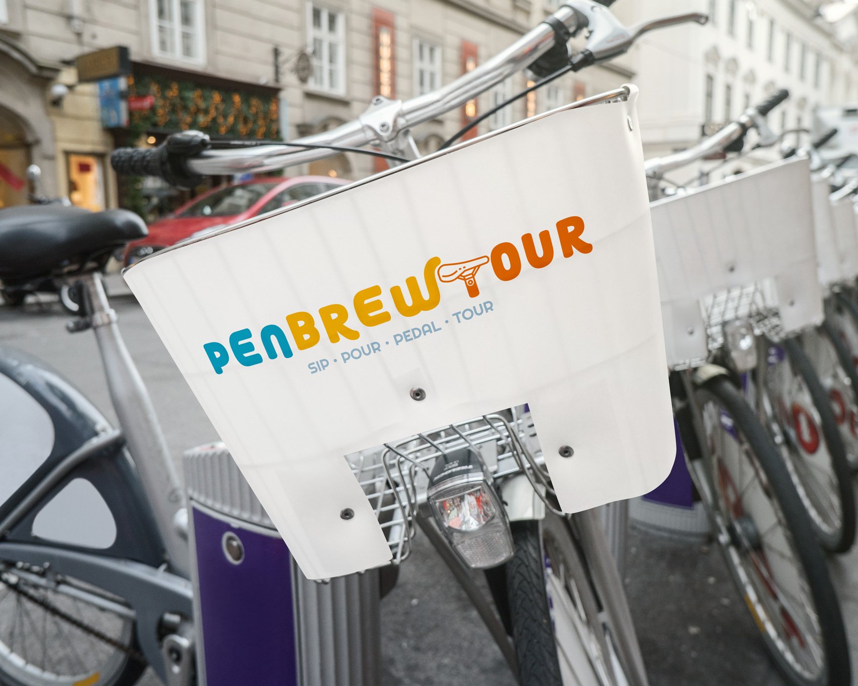
It all started with a simple introduction from my friend, a skilled developer, to his buddy living the good life in Penticton. Known for its love of wine and beer, the town was the perfect setting for PenBrewTours, the ultimate pedal-your-way brewery tour focused on fun and relaxation. They recognized the need for a brand that perfectly captured their laid-back, enjoyable, and slightly retro vibe.
-
Inspired by the unforgettable moments spent hanging out with friends, we dove headfirst into the creative process. Our goal was to create a logo that would radiate the spirit of Penticton summers.
Embracing the laid-back and vibrant atmosphere, we designed a logo with bold and dynamic elements. The killer retro colour palette added a touch of nostalgia and energy, perfectly aligning with the fun and enjoyment that PenBrewTours offered its customers. -
The brand perfectly embodied the essence of PenBrewTours - a pedal-your-way brewery tour that promised a blast of good times and great beer. With its bold and vibrant design, the logo became an instant hit, capturing the attention and hearts of both locals and tourists alike.

The best beers are the ones we drink with friends.

IPA = Identity, Passion, Alcohol
PenBrewTours now stands as a shining example of how a well-crafted brand identity can elevate the experience and leave a lasting impression on its audience. Cheers to good times, great beer, and the unforgettable memories made along the way!